Write Task 1 Answers Confidently (5 Steps)
At first, the way IELTS wants you to write Task 1 answers looks pretty complicated.
By following the 5 steps in this lesson, you will always know what you need to do for any graph in Academic Writing Task 1.
With the sample answers below, I will show you how to prepare, what to write and how to overcome the most common difficulties.

Lesson contents;
- Steps to Write Task 1 Answers
- How to Write Task 1 Answers: Example A
- How to Write Task 1 Answers: Example B
- How to Write Task 1 Answers: Example C
- How to Write Task 1 Answers: Example D
- How to Write Task 1 Answers: Example E
- How to Write Task 1 Answers: Bonus Tips
Steps to Write Task 1 Answers
Step 1: Analyse the Question
To help you organise the categories and notice any patterns to describe in your essay, draw arrows and make notes on the question sheet.
In this Writing Task 1 question which we will look at later, you can see the types of annotations you need to make.
Step 2: Paraphrase question
To paraphrase the question, you rewrite it in your own words.
The most important thing is that your paraphrase has the exact same meaning as the question.
Firstly, divide the Writing Task 1 question into shorter pieces, like the four pieces in the image below.
Then rewrite each piece using as many different words as possible.
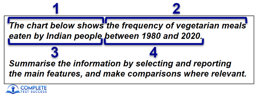
This is a paraphrase of the above question;
The graph illustrates how often vegetarian dishes were eaten by people in India from 1980 to 2020.
Step 3: Write the Overview
Just like we learned in the overview lesson, when the chart shows data for just one year, we will organise the categories according to highest and lowest, and for more than one year according to increases and decreases.
Then we describe the most significant features in a general way without including any data.
In your essay, write the overview in the first paragraph with the paraphrase.
Step 4: Write Details Paragraphs
The details paragraphs are the second and third paragraphs of your answer.
In these, we describe and report the figures for each of the categories in the graph.
Keep in mind that our essay aims to compare the categories, so we can’t list every piece of data one after the next.

Step 5: Proofread
Many IELTS candidates feel there isn’t enough time to proofread, but IELTS.org confirms here that it’s essential.
Before the test, you need to know the three or four types of mistakes you make most often.
After writing the answer, find and fix these mistakes for the remainder of the 20 minutes.
How to Write Task 1 Answers: Example A
Bar Chart Writing Task 1 Question
Bar Chart Annotations
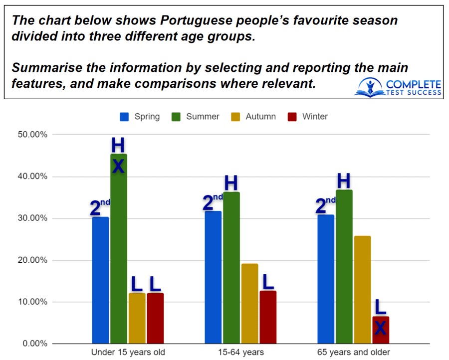
- As we learned in the overview lesson, this chart has just one year, so we organise the categories from highest to lowest.
These are the ‘H‘s and ‘L‘s I’ve marked on the question. - I also made a note that spring is the second-highest category for the three age groups.
- Finally, I put an ‘X‘ on summer for the youngest group because that’s the highest percentage in the entire chart and an ‘X‘ on winter for the oldest age group because this is the lowest figure in the chart.
Bar Chart Sample Answer
The graph illustrates people in Portugal’s preferred season separated by age categories. Overall, summer is the most, whereas winter is the least popular season for all three age groups, but autumn is equally unpopular with the youngest group.
For the group aged under 15 years old, summer has the highest percentage for any season among the three groups with about 45%. Spring is the second-most liked with this age group at approximately 31%, while autumn and winter have the same percentages of roughly 12%, so they are equally the least liked seasons for the youngest age group.
The 15-65-year-olds also like summer best and spring second-best with around 36% and 32%, respectively. Just under 20% of this age group prefer autumn, while about 13% choose winter as the season they like the most. Although Portuguese people aged 65 years and older have similar figures for summer, approximately 37%, and spring, just over 30%, autumn is more popular with roughly 26%, whereas winter is less popular at around 7%.
Bar Chart Comments:
Superlatives
Superlatives are very useful in Writing Task 1. They allow us to write an overview without having to write the name of every category.
For example, the overview above says, “Summer is the most popular season for all three age groups.”
The sentence describes summer, but we also learn that the rest of the seasons have percentages lower than summers’ percentages.

Only Use the Information Provided
When I first looked at this chart, I thought it’s pretty obvious why Portuguese people like summer best; the weather is nicer, and everyone gets time off work or school.
However, this information is not provided in the chart, so I cannot include it in my essay.
Paraphrasing the Category Names
A lot of IELTS candidates use inaccurate synonyms for category names.
In Writing Task 1, I usually don’t use any synonyms for category names. You can see that I’ve done this with spring, summer, autumn and winter.
However, in this essay, I did use the phrase ‘the youngest age group’ to refer to the group ‘under 15 years old’. This is a simple and accurate synonym, so I was comfortable using it.
Proofreading
While proofreading, I firstly checked for oxford commas as I often forget to include these.
Next, I checked for my use of present simple. Because most charts are in the past, I automatically use past simple when I write Task 1 answers. I found some instances of this mistake and fixed them.

Finally, I didn’t use enough of the various words for estimates. I had mostly used the words ‘about‘ and ‘roughly‘, so while I was proofreading, I needed to swap in some of the other words to improve my range.
How to Write Task 1 Answers: Example B
Line Graph Writing Task 1 Question
Line Graph Annotations
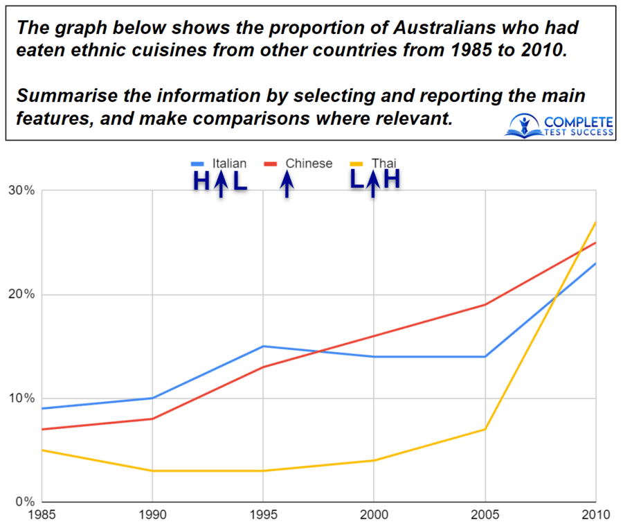
- The arrows under each category indicate that they increased.
- You’ll notice that on the left of the arrow for Italian cuisine, I put a ‘H‘ to show that this category was the highest at the start of the period, and I put an ‘L‘ on the right to show that it was the lowest category at the end of the period.
- I marked Thai cuisine in the same way with an ‘L‘ on the left and a ‘H‘ on the right.
Line Graph Sample Answer
The chart illustrates the percentage of people in Australia that had eaten the ethnic cuisines of 3 different countries between 1985 and 2010. Overall, by the end of the period, there was an increase in the percentage of Australians who had eaten all 3 kinds of food, and Thai had replaced Italian cuisine as the most commonly eaten.
Italian food started as the food that the highest percentage of Australian people had tried at approximately 9%, and this increased to roughly 15% in 1995. This figure then decreased until 2005 by about 3% before jumping to around 23% in the final year. Meanwhile, the figure for Australians who had eaten Chinese cuisine grew throughout the entire period to go from approximately 7% in the beginning to roughly 25% at the end.
Thai cuisine began with the lowest figure, about 5%, which fell slightly to around 3% in 1995. After this, the percentage had a slight growth until 2005, after which it climbed suddenly to end the period with approximately 27%, making it the cuisine that more Australians had tried in 2010.
Line Graph Comments:
Considering Organisation
When organising my details paragraphs, I had two things to consider.
Firstly, to logically organise the categories, I started with the highest in 1985, then the second-highest and the lowest.

Secondly, with just three categories, I had to decide which details paragraph would describe only one category.
As there is more to say about Thai cuisine, I put this in the final details paragraph by itself.
Only Include Significant Data
When describing the categories in the details paragraphs, you’ll see that I didn’t include the data for every year.
For example, I didn’t include the figures for Chinese cuisine in 1990, 1995, 2000 or 2005.
Always describe the first and last years of the categories and then just include any years with significant changes.
Accurate Descriptions
You also need to make sure that you accurately describe what the chart represents.
A lot of IELTS candidates incorrectly write, “Italian food increased…”
But the graph is about eating habits, so we write, “The percentage of Australians who had eaten Italian food increased…”

Proofreading
When proofreading this essay, I noticed that I had overused the words ‘increase‘ and ‘decrease‘ so deleted some of these and replaced them with synonyms to improve my range of vocabulary.
If you’re doing the paper-based test, you can do this by crossing out a word and writing the synonym above. Don’t worry if it looks a bit messy as long as the examiner can read it.
How to Write Task 1 Answers: Example C
Pie Chart Writing Task 1 Question

Pie Chart Annotations
- This one was pretty straightforward, and I just put a ‘H‘ in the highest category for each country and an ‘L‘ in the lowest.
- You’ll see that Zambia has two ‘L‘s because both of the categories have the same percentage.
Pie Chart Sample Answer
The graphs illustrate the data about which environmental issues three nationalities feel are the most concerning. Overall, people from Singapore and Zambia are most concerned about overpopulation, while Cameroonian people are more concerned with waste disposal. In Zambia, pollution and waste disposal are equally causing the least concern, whereas the other countries see pollution as the least concerning.
Overpopulation is the biggest concern in Singapore with 37%, followed by global warming at 26%. Waste disposal can be seen to have 21%, while Singaporean people are least concerned by pollution, which has a percentage of 16%. Similarly, Zambian people also see overpopulation as the most concerning and global warming as the second-most concerning environmental problems with 43% and 29%, respectively. However, in Zambia, waste disposal and pollution have the same percentage of 14%.
In contrast, the environmental issue causing the most concern in Cameroon is waste disposal at 42%, followed by overpopulation with the next highest percentage of 23%. Global warming had a figure of 19% amongst Cameroonians, and pollution is causing the least concern with 16%.
Pie Chart Comments:
Comparing the Categories
Part of the requirement in Writing Task 1 is to ‘make comparisons where relevant’.
For this, I described Singapore and Zambia in the first details paragraph to draw attention to their similarities and differences.
As Cameroon had a lot of differences, I discussed this in another paragraph and used the cohesive device ‘in contrast‘ to explain that it was different from the others.

Don’t Take Risks With Vocabulary
One thing I wasn’t happy about in this answer was the number of times I used the word ‘concerned‘, especially because this word was in the question.
The only synonym that I could think of was ‘worried‘, but I decided not to use that as ‘worried‘ is a stronger emotion than ‘concerned‘ and not close enough in meaning for me to use it confidently.
Instead, I varied my language as much as possible with the word ‘concerned’ and its derivatives ‘concern’ and ‘concerning’.
How to Write Task 1 Answers: Example D
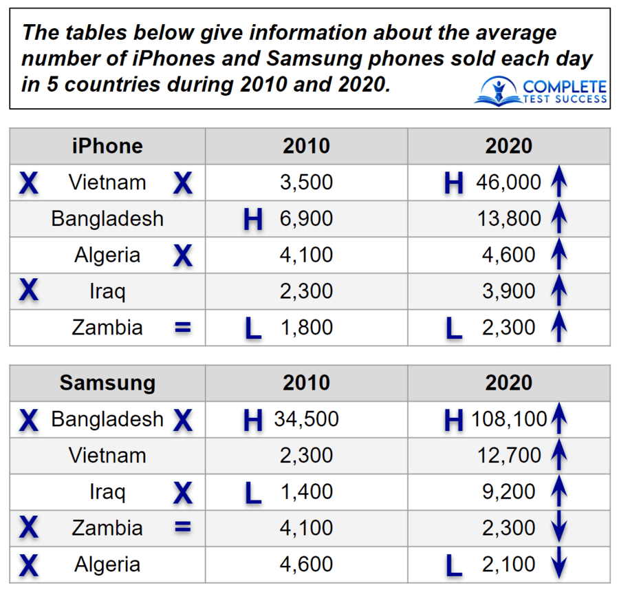
Table Writing Task 1 Question
Table Annotations
- The ‘H‘s and ‘L‘s represent the highest and lowest figures for each device in each year.
- The arrows represent increases or decreases between 2010 and 2020.
- The ‘X‘s on the left side of the countries represent if more iPhones or Androids were purchased in 2010. For example, in 2010, Iraq purchased more iPhones than Androids, so the ‘X‘ is located on the left of Iraq in the iPhone table.
- The ‘X‘s on the right side of the countries represent if more iPhones or Androids were purchased in 2020. Zambia has an ‘=’ symbol as the figure was the same for both devices.
Table Sample Answer
The charts show data on how many iPhones and Samsung phones were bought daily by five countries in 2010 and 2020. Overall, the sales of both devices increased in every country except in Zambia and Algeria for Samsung.
Each day, Bangladesh bought the most Samsung phones in 2010 and 2020 with an average of 34,500 and 108,100 units, respectively. Furthermore, Bangladesh also purchased the largest number of iPhones in 2010 at a daily average of 6,900, increasing further to 13,800 in 2020. In Vietnam, iPhone sold 3,500 units each day, and this grew considerably to 46,000 in 2020, making Vietnam the country with the most iPhone purchases that year.
In Iraq, from 2010 to 2020, iPhone sales rose from 2,300 to 3,900, and the figures for Samsung went up substantially from 1,400 to 9,200. Zambia also had an increase in iPhone sales of 500 units each day on average but had a decrease in Samsung sales by 1,800 phones. Algeria had a similar trend to Zambia, with an increase of 500 daily purchases of iPhones but a decrease of 2,500 Samsung phones.
Table Comments:
Which Categories to Prioritise
With so much data, I decided to only describe Bangladesh and Vietnam in detail as they had the highest figures.
Deciding What to Exclude
As the lowest figures belonged to three countries, I knew I couldn’t discuss them all so excluded this information.

Being Less Descriptive
In the final paragraph, I needed to describe three countries, each with four pieces of data.
This is why my descriptions are brief.
Firstly, I described the data for Iraq as concisely as possible with only one word, ‘substantially’, offering any additional information.
Next, I described the sizes of the increases and decreases for Zambia and Algeria so that just two figures were required for each country.
Finally, I kept in mind that my essay needs to ‘make comparisons where relevant‘ and used the words ‘also‘, ‘but‘ and ‘had a similar trend‘ to help me do this.
How to Write Task 1 Answers: Example E
Multiple Charts Writing Task 1 Question
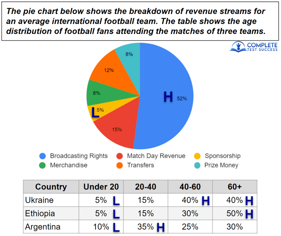
Multiple Charts Annotations
- Here I just put ‘H‘s for all the highest and ‘L‘s for all the lowest figures.
Multiple Charts Sample Answer
The pie graph illustrates the sources of income for the average country’s soccer team. The table details how old attendees at international football games are in three countries. Overall, the most revenue comes from broadcasting rights and the least through sponsorships. At Argentinian matches, the most common age group is 20-40, whereas, in Ukraine, it’s evenly divided between the 40-60 and 60+ age groups. In Ethiopia, however, it’s the group aged 60+ that attends the most.
Broadcasting rights account for 52% of the earnings for international soccer teams, followed by match day revenue with 15%. Transfers, merchandise and prize money each account for between 12% and 8%, while sponsorship has the lowest figure of 5%.
In Argentina, the most common age group at the country’s football games is 20-40, with 35%, followed by 60+, 40-60 and under 20 at 30%, 25% and 10%, respectively. The most common age groups in Ukraine are 60+ and 40-60, each representing 40%, while the 20-40s have 15% and the youngest group has 5%. In Ethiopia, the majority were 60+ with 50%, the 40-60-year-olds have 30%, the 20-45s represent 15%, and the under 20s have 5%.
Multiple Charts Comments:
No Specific Data in the Overview
We cannot put specific data in the overview.
This is why I had to say, ‘in Ukraine, it’s evenly divided between the 40-60 and 60+ age groups‘.
That description is more complicated than saying, ‘in Ukraine, the 40-60 and 60+ age groups both have 40%’.
However, in our overviews, our descriptions mustn’t include data or else our score will suffer.
Being Concise
For questions like this with many categories and a lot of data, our descriptions must be more concise than usual.
Here is how I adapted my writing in response to this;

- I described 3 categories as being within a range of data instead of saying the actual figures for each one.
This is the description I’m referring to; Transfers, merchandise and prize money each account for between 12% and 8%.
You should only do this when there is a lot of data to describe.
Also, this is only suitable when the values of the categories are relatively close to one another.
For example, if I wrote, “All the sources of income account for between 52% and 5%,” this would be inappropriate because the range is too big. - I used the word ‘respectively’ to cover 3 pieces of data.
This is the part of the essay I’m referring to; followed by 60+, 40-60 and under 20 at 30%, 25% and 10%, respectively.
I normally wouldn’t include more than two pieces of data in this structure, but it was necessary here. - I became less descriptive as I progressed through the details paragraphs because it’s already clear what the data is about.
For the last country described, I didn’t even mention the word football.
Here it is again; In Ethiopia, the majority were 60+ with 50%, the 40-60-year-olds have 30%, the 20-45s represent 15%, and the under 20s have 5%.
How to Write Task 1 Answers: Bonus Tips
Should I do Writing Task 1 or Task 2 first in my IELTS test?
Honestly, you should do whatever makes you most comfortable, but I do have some advice to help you decide.
I would suggest that you start with whichever task you’re better at.
By doing your best first, you won’t use more than the allocated time. That is to say more than 20 minutes for Task 1 or 40 minutes for Task 2.

My other piece of advice is to finish writing one answer before you look at the other question.
For example, if you do Task 1 first, don’t read the Task 2 question until after writing the Task 1 essay.
This is because you don’t want to think about the Task 2 question while you write the Task 1 answer.
That would be distracting, and you already need 100% of your focus and brainpower to achieve the highest possible score.
How Can I Check My Own Writing?
A great way to check your writing is to compare your own answers with reliable sample answers you find online.
Besides that, you can check your essay for the following mistakes;

- The essay is too short. (fewer than 150 words)
- The essay is too long. (more than 210 words)
- The overview contains data.
- The details paragraphs contain inaccurate data.
- You’ve taken risks with vocabulary, so some words might be wrong.
If you’re taking the paper-based IELTS test, practise with the official answer sheet here to become familiar with how many lines you need.
If you’re taking the computer-based IELTS test, you’re shown the word count on screen, as you can see in the sample test here.
Of course, you might find some vocabulary or grammar mistakes in your essay, but in most cases, you won’t know that you’ve made a mistake.
To help you with this, I have free Live Feedback Lessons with my newsletter subscribers every week. You can sign up below.
What now?
First of all, you’ll need to practise doing this for yourself. Get used to following the 5 steps and considering all the different ways to analyse, organise and describe.
If this lesson was too involved for you, I would recommend that you check out the lessons here, here and here by the British Council, and you can revisit this one at a later time.
Or, you could watch this video to help you review the lesson.
If you haven’t already completed the Overviews Made Easy lesson, you’ll definitely need to do that next and you’ll need to learn how to answer map questions and process questions.
Now, you know how to write Task 1 essays, but you also need to understand how your answer is scored and all the phrases you can use for Writing Task 1 questions about graphs, so make sure to learn about these in my Task Achievement, Coherence and Cohesion, Vocabulary and Grammar lessons.