IELTS Writing Task 1 Sample Answers
Without access to high-quality Academic IELTS Writing Task 1 sample answers, it’s almost impossible to understand how to write these.
Below, you will find sample questions, band 9 sample answers and videos highlighting the most common mistakes candidates make.

Contents:
- Tips to Improve your Scores
- Sample Answer #1
- Sample Answer #2
- Sample Answer #3
- Sample Answer #4
- Sample Answer #5
- Sample Answer #6
- Sample Answer #7
- Sample Answer #8
- Sample Answer #9
- Sample Answer #10
- Sample Answer #11
- Sample Answer #12
- Sample Answer #13
- Sample Answer #14
- Sample Answer #15
- Sample Answer #16
- Sample Answer #17
- Sample Answer #18
- Sample Answer #19
- Sample Answer #20
- Sample Answer #21
- Sample Answer #22
- Sample Answer #23
- Sample Answer #24
- Sample Answer #25
- Sample Answer #26
- Sample Answer #27
Tips to Improve Your Scores
If you read the sample answers on this page, this will help you better understand how to construct a Task 1 essay.
However, if you write your own answer first and then compare your answer with the sample answer, you’ll learn a lot more about how you must adjust your approach.
Finally, if you haven’t yet learned how to write a Task 1 essay, you should complete my Academic IELTS Task 1 Lessons.
IELTS Writing Task 1 Sample Answer #1
Sample Question #1

Feedback Video #1
Sample Answer #1
The chart illustrates the average amount of cheese eaten by citizens of England, Scotland, Wales and Northern Ireland from 1980 to 2020. Overall, England’s figures declined steadily throughout the period, and Scotland saw a significant decline by the end, whereas people in Wales and in Northern Ireland both increased their cheese consumption during these decades.
Despite being the largest consumer of cheese for each decade, England’s figures fell consistently from roughly 112 kg in 1980 to approximately 88 kg in 2020. Meanwhile, Scotland started with about 85kg before jumping to roughly 105 kg in 1990. From that point, the figures dropped significantly until it was down to approximately 55 kg in 2020.
Wales went from having the second-lowest figure in 1980, roughly 45 kg, to having the second-highest average consumption of cheese in 2020 with approximately 80 kg after increasing throughout the entire period. Northern Ireland showed increases every decade and went from about 12 kg in the beginning to roughly 60 kg.
IELTS Writing Task 1 Sample Answer #2
Sample Question #2

Feedback Video #2
Sample Answer #2
The graph illustrates the amount of money on average spent on different kinds of sporting equipment by shoppers at a sports shop in Canada. Overall, football accounted for the most spent at the beginning and the end of the period and saw an overall increase. Swimming also rose over the period whereas rugby and tennis both decreased.
Football saw an initial drop from $60 per person in 2000 to $40 in 2010, meaning that it was replaced by rugby as the sport with the highest sales. However, from that point to the end of the period, it climbed to finish the period at $70 in 2020 and had the highest value again. Meanwhile, sales of swimming equipment began at $10 in 2000 and declined steadily throughout the time shown to end at $30.
Although the sales value of rugby equipment increased from 2000 to 2010, with $40 and $60 respectively, this trend was reversed over the next 10 years, and it ended on $30 being spent per customer. The value of tennis equipment decreased steadily from start to finish, with an initial value of $30 and a final value of $10.
IELTS Writing Task 1 Sample Answer #3
Sample Question #3
Feedback Video #3
Sample Answer #3
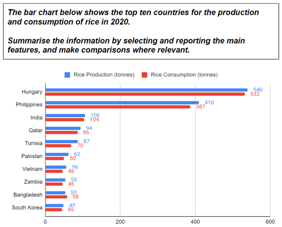
The graph illustrates the ten nations that grew and ate the most rice in the year 2020. Overall, Bangladesh is the only country where rice consumption was higher than the amount of rice produced, and the figures for Hungary and the Philippines far exceed the other eight countries in both rice grown and eaten.
Of the ten countries on the graph, Bangladesh was unique in that it was the only nation to produce less rice than it consumed, with 53 and 58 tonnes, respectively. Hungary produced and consumed the most rice in 2020, with 540 tonnes grown and 532 tonnes eaten. The Philippines was the only country close to Hungary’s figures with 410 tonnes produced and 387 tonnes consumed.
For the other eight nations, the production of rice was between 106 and 49 tonnes, and the consumption of rice was between 104 and 45 tonnes. For both of the categories, India was the highest of these eight countries, and South Korea was the lowest.
IELTS Writing Task 1 Sample Answer #4
Sample Question #4

Feedback Video #4
Sample Answer #4
The charts illustrate how many phone calls a car manufacturer’s Nigerian call centre took, according to which car model was discussed. Overall, the number of calls for every model, except model C, decreased between 2010 and 2015.
The number of calls taken concerning the Model C car was the only figure that increased between 2010 and 2015 with 71 and 84 respectively. Model A, on the other hand, was responsible for 52 calls to the Nigerian call centre in 2010, and this total decreased to 49 in 2015. Meanwhile, the number of callers discussing Model B went from 33 down to 24, meaning that it had the lowest figure in both years.
Of all the cars manufactured by this company, Model D, despite seeing a decline from 94 to 88 calls, was the most discussed car model during both 2010 and 2015. Model E also had a fall in the number of calls it was associated with, dropping from 68 in 2010 to 57.
IELTS Writing Task 1 Sample Answer #5
Sample Question #5

Feedback Video #5
Sample Answer #5
The charts illustrate how many phone calls a car manufacturer’s Nigerian and Indian call centres took, according to which car model was discussed. Overall, in both countries, the number of calls received for Models D and E went down, but Model C went up. However, for Models A and B, there was a decrease in Nigeria, while there was an increase in India.
Between 2010 and 2015, the number of calls for Model D decreased by 6 and 44 for Nigeria and India, respectively. In the Nigerian centre, the Model E went from having 68 calls in 2010 down to 57, while these figures were 476 and 399 for the Indian one. On the other hand, Model C was responsible for increasing calls in both countries, going from 71 to 84 in Nigeria and 402 to 476 in India.
Meanwhile, Model A saw a decrease in the Nigerian call centre, with the number of calls going from 52 in 2010 to 49 in 2015, but in India, there was an increase as the numbers went from 322 to 380 calls. Model B had a similar pattern, falling from 33 to 24 in Nigeria but rising from 184 to 192 in India.
IELTS Writing Task 1 Sample Answer #6
Sample Question #6

Feedback Video #6
Sample Answer #6
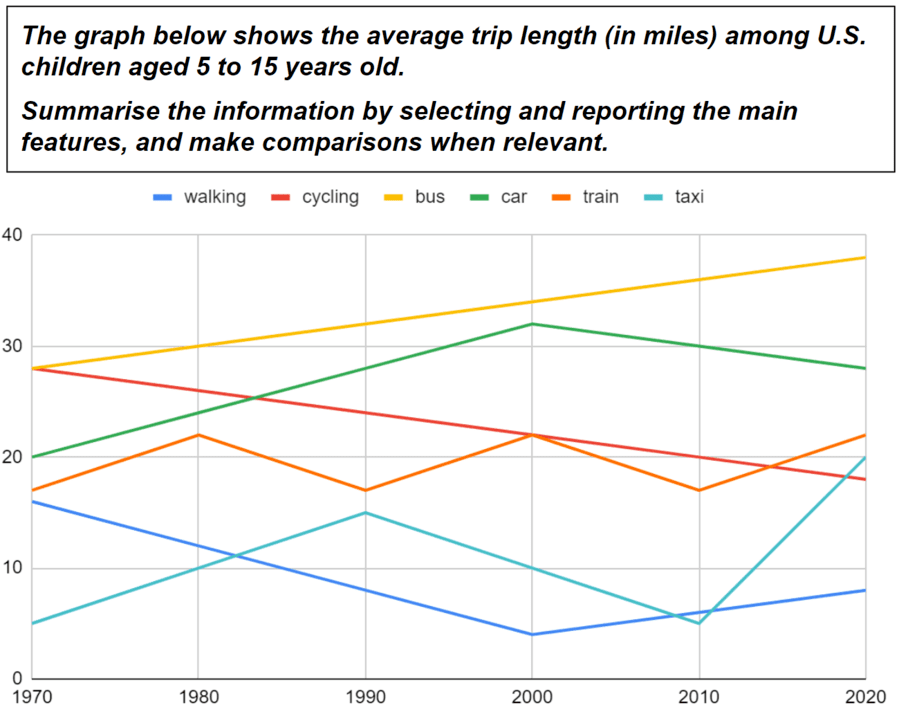
The chart illustrates the average journey distance of 5 to 15-year-olds in the United States from 1970 until 2020. Overall, the distance travelled by bus and car increased, but the distance travelled by walking and cycling decreased.
In 1970, the average trip by bus was approximately 28 miles, and this grew steadily throughout the period to finish at roughly 38 miles in 2020, meaning it had the highest figure for every year shown. The distance travelled by car increased from about 20 miles in 1970 to around 33 in 2000 but fell steadily for the rest of the period to finish with approximately 27.
Cycling began with the same figure as travelling by bus with about 28 miles on average, but this mode of transport saw a steady drop until 2020 when its final number was roughly 18 miles. The distance travelled by walking decreased from 1970 to 2000, with around 16 and 5 miles respectively; however, it increased for the rest of the period to reach roughly 8 miles in 2020.
Free Live Feedback Lessons
For more support with your IELTS preparation, you can join my Complete Test Success Academy and sign up below for my free lessons.
IELTS Writing Task 1 Sample Answer #7
Sample Question #7
Feedback Video #7
Sample Answer #7
The chart illustrates the average journey distance of 5 to 15-year-olds in the United States from 1970 until 2020. Overall, the distance travelled by bus, car, train and taxi increased, but the distance travelled by walking and cycling decreased.
In 1970, the average trip by bus was approximately 28 miles, and this grew steadily throughout the period to finish at roughly 38 miles in 2020. The distance travelled by car increased from about 20 miles in 1970 to around 33 in 2000 but from that point fell steadily to finish with approximately 27. Despite fluctuations, the figures for trains and taxis increased by around 5 and 15 miles respectively.
Cycling began with about 38 miles on average but saw a steady drop until 2020 when its final number was roughly 18 miles. The distance travelled by walking decreased from 1970 to 2000, with around 16 and 5 miles respectively; however, it increased from then to reach roughly 8 miles in 2020.
IELTS Writing Task 1 Sample Answer #8
Sample Question #8

Feedback Video #8
Sample Answer #8
The graph illustrates people in Portugal’s preferred season separated by age categories. Overall, summer is the most, whereas winter is the least popular season for all three age groups, but autumn is equally unpopular with the youngest group.
For the group aged under 15 years old, summer has the highest percentage for any season among the three groups with about 45%. Spring is the second-most liked with this age group at approximately 31%, while autumn and winter have the same percentages of roughly 12%, so they are equally the least liked seasons for the youngest age group.
The 15-65-year-olds also like summer best and spring second-best with around 36% and 32%, respectively. Just under 20% of this age group prefer autumn, while about 13% choose winter as the season they like the most. Although Portuguese people aged 65 years and older have similar figures for summer, approximately 37%, and spring, just over 30%, autumn is more popular with roughly 26%, whereas winter is less popular at around 7%.
IELTS Writing Task 1 Sample Answer #9
Sample Question #9

Feedback Video #9
Sample Answer #9
The chart illustrates the percentage of people in Australia that had eaten the ethnic cuisines of 3 different countries between 1985 and 2010. Overall, by the end of the period, there was an increase in the percentage of Australians who had eaten all 3 kinds of food, and Thai had replaced Italian cuisine as the most commonly eaten.
Italian food started as the food that the highest percentage of Australian people had tried at approximately 9%, and this increased to roughly 15% in 1995. This figure then decreased until 2005 by about 3% before jumping to around 23% in the final year. Meanwhile, the figure for Australians who had eaten Chinese cuisine grew throughout the entire period to go from approximately 7% in the beginning to roughly 25% at the end.
Thai cuisine began with the lowest figure, about 5%, which fell slightly to around 3% in 1995. After this, the percentage had a slight growth until 2005, after which it climbed suddenly to end the period with approximately 27%, making it the cuisine that more Australians had tried in 2010.
IELTS Writing Task 1 Sample Answer #10
Sample Question #10

Feedback Video #10
Sample Answer #10
The graphs illustrate the data about which environmental issues three nationalities feel are the most concerning. Overall, people from Singapore and Zambia are most concerned about overpopulation, while Cameroonian people are more concerned with waste disposal. In Zambia, pollution and waste disposal are equally causing the least concern, whereas the other countries see pollution as the least concerning.
Overpopulation is the biggest concern in Singapore with 37%, followed by global warming at 26%. Waste disposal can be seen to have 21%, while Singaporean people are least concerned by pollution, which has a percentage of 16%. Similarly, Zambian people also see overpopulation as the most concerning and global warming as the second-most concerning environmental problem with 43% and 29%, respectively. However, in Zambia, waste disposal and pollution have the same percentage of 14%.
In contrast, the environmental issue causing the most concern in Cameroon is waste disposal at 42%, followed by overpopulation with the next highest percentage of 23%. Global warming had a figure of 19% amongst Cameroonians, and pollution is causing the least concern with 16%.
IELTS Writing Task 1 Sample Answer #11
Sample Question #11

Feedback Video #11
Sample Answer #11
The charts show data on how many iPhones and Samsung phones were bought daily by five countries in 2010 and 2020. Overall, the sales of both devices increased in every country except in Zambia and Algeria for Samsung.
Bangladesh bought the most Samsung phones in 2010 and 2020 with an average of 34,500 and 108,100 units per day, respectively. Furthermore, Bangladesh also purchased the largest number of iPhones in 2010 at an average of 6,900, increasing further to 13,800 in 2020. In Vietnam, iPhone sold 3,500 units each day, and this grew considerably to 46,000 in 2020, which was the highest figure for iPhone during that year. Meanwhile, Samsung sales in Vietnam increased significantly from 2,300 to 12,700 in the same period.
In Iraq, from 2010 to 2020, iPhone sales rose from 2,300 to 3,900, and the figures for Samsung went up substantially from 1,400 to 9,200. Zambia also had an increase in iPhone sales of 500 units each day on average but had a decrease in Samsung sales by 1,800 phones. Algeria had a similar trend to Zambia, with an increase of 500 daily purchases of iPhones but a decrease of 2,500 Samsung phones.
IELTS Writing Task 1 Sample Answer #12
Sample Question #12

Feedback Video #12
Sample Answer #12
The pie graph illustrates the sources of income for the average country’s soccer team. The table details how old attendees at international football games are in three countries. Overall, the most revenue comes from broadcasting rights and the least through sponsorships. At Argentinian matches, the most common age group is 20-40, whereas, in Ukraine, it’s evenly divided between the 40-60 and 60+ age groups. In Ethiopia, however, it’s the group aged 60+ that attends the most.
Broadcasting rights account for 52% of the earnings for international soccer teams, followed by match-day revenue with 15%. Transfers, merchandise and prize money each account for between 12% and 8%, while sponsorship has the lowest figure of 5%.
In Argentina, the most common age group at the country’s football games is 20-40, with 35%, followed by 60+, 40-60 and under 20 at 30%, 25% and 10%, respectively. The most common age groups in Ukraine are 60+ and 40-60, each representing 40%, while the 20-40s have 15% and the youngest group has 5%. In Ethiopia, the majority were 60+ with 50%, the 40-60-year-olds have 30%, the 20-45s represent 15%, and the under-20s have 5%.
IELTS Writing Task 1 Sample Answer #13
Sample Question #13

Feedback Video #13
Sample Answer #13
The maps display the University Hospital in Kingston as it was in 1990 and again in 2020. Overall, Nessan’s Road runs from east to west at the bottom, and the hospital is located above this. By 2020, the main change is that the farmland had been replaced with infrastructure for the hospital.
The farmland that stood in the northeast of the map had been replaced by a new hospital building used for inpatients, and the area of farmland in the east was being used as additional parking space in 2020. The original hospital building in the northwest of the map is now being used exclusively for treating outpatients.
At the west end of Nessan’s Road, a new entrance was added specifically for ambulances and a road leading to the outpatient building. To the east, the old entrance became the public entrance, and that road to the hospital had two roundabouts built on it; the first giving access to the parking area and the second for accessing a new road which extends to the east and ends with a third roundabout for entering the inpatient building or the northern entrance to the parking facility.
IELTS Writing Task 1 Sample Answer #14
Sample Question #14

Feedback Video #14
Sample Answer #14
The maps display a countryside town in 1983 and its current appearance. Overall, Main Road cuts through the centre from west to east and is intersected roughly halfway by the River May, which extends from north to south. The main changes are an increase in residential and commercial buildings.
In the west, the five houses already built in 1983 are still standing, and to the west of the River May, the school, to the north, and police station, to the south of Main Road, have remained unchanged. On the far side of the river, the post office is still in place, as is the windmill further to the south.
East of the post office, Munster Road connects with Main Road, where a petrol station has replaced the farm. Travelling southeastward on Munster Road, a cafe is seen to have been constructed. Returning to Main Road, on the east side of the town, a supermarket has taken the place of the shop. Moving to the northwest corner of the map, the forest has been cleared to make way for a cul-de-sac named High Road lined with an additional nine houses. Finally, on the northern end of the May River, a dam has been constructed.
IELTS Writing Task 1 Sample Answer #15
Sample Question #15

Feedback Video #15
Sample Answer #15
The chart shows details of the alterations in the military spending of eight countries between the years 2004 and 2020. Overall, the total increased, as did the amount spent by all the countries except the United Kingdom and Italy. In both years, the United States’ budget was highest, and Italy’s was the least.
The total money spent by all eight countries increased from $930.2bn in 2004 to $1,125.8bn in 2020. The United states spending went from $623bn to $778bn, keeping it as the country with the highest amount spent. Of the eight countries, China’s spending had the most significant rise as it went from $65bn to $178bn, whereas the Russian military budget had a more moderate increase from $50bn to $61.7bn.
Of the remaining countries, France’s figure of $45bn was the highest in 2004, and this rose to $48.3bn. While the United Kingdom had a decrease of $1.3bn, in Japan and Germany, there was a growth of $10.7bn and $16.4bn, respectively. Meanwhile, Italy continued to have the lowest figure as its budget went from $28.2bn down to $15bn.
IELTS Writing Task 1 Sample Answer #16
Sample Question #16

Feedback Video #16
Sample Answer #16
The illustration shows the floor plans of a public library now and after its intended development. Overall, it’s a one-floor library and has steps leading up to the entrance. The main difference is that the library currently has one large room and will be extended to the east, roughly doubling its size.
After the extension, on the east side of the library, there will be a new entrance into a kid’s area where the kid’s books will be moved, and additional seating will be added. To the south of the kid’s area will be a computer room, and to the north will be a store and a staff room with its own staff entrance.
The existing room, to be considered the main area, will be narrower due to an internal wall constructed from the north to the south end of the building. The male and female restrooms, original entrance, and sections for romance and thriller will all remain unchanged within this area. However, the seating, fantasy and mystery sections will be moved closer to the west side of the building to accommodate the changes.
IELTS Writing Task 1 Sample Answer #17
Sample Question #17

Feedback Video #17
Sample Answer #17
The table illustrates how many students were in a Malaysian primary and secondary school during 2005, while the pie charts indicate the sports these students liked best. Overall, the primary school had fewer students, and the most popular sport was tennis, whereas football was the most liked in the secondary school. In both schools, rugby had the lowest figure, but this was joined by swimming in the secondary school.
The primary school had 73,000 students, and 40% of them stated that tennis was their favourite sport. The next most popular was football with 30%, followed by basketball and swimming at 15% and 10%, respectively. Rugby was the sport that the fewest students liked best and had a percentage of 5%.
In the secondary school, there were 91,000 students, and football had the highest figure of 40%. The second-most popular sport was basketball at 35%, while tennis had less than half this figure with 15%. As in the primary school, rugby had the lowest percentage of 5%, but swimming also had the same number among these students.
IELTS Writing Task 1 Sample Answer #18
Sample Question #18

Feedback Video #18
Sample Answer #18
The graph illustrates the differences in the income of 5 toothpaste companies in 2000 and 2005 in comparison with their income in 1995. Overall, compared to 1995, Sensodyne and Aquafresh’s revenue were higher in both years, while Crest’s was lower in both years. For Colgate and Close up, their revenue was lower in 2000 but higher in 2005.
Sensodyne’s income in 2000 was about 1% higher than in 1995, and this increased to roughly 4% higher in 2005. For Aquafresh, on the other hand, there was an increase of around 3% in 2000 but a slightly lower increase of approximately 1% in 2005. Meanwhile, the revenue in 2000 for Crest was about 7% lower than their revenue in 1995, and, in 2005, there was a marginally smaller decrease of roughly 5%.
The money made by Colgate in 2000 was around 5% lower, whereas in 2005 the figure was approximately 5% higher than in 1995. Close up made about 7% less in 2000 but roughly 12% more in 2005, giving them the most significant increase on 1995’s earnings of any company in the years shown.
IELTS Writing Task 1 Sample Answer #19
Sample Question #19

Feedback Video #19
Sample Answer #19
The chart illustrates how many appliances were sold in an electronic shop in Ghana between 1965 and 2000. Overall, the number of refrigerators was the highest throughout the period and had an upward trend by the end, as did the number of washing machines and televisions sold. In contrast, the unit sales of phones were relatively the same by the final year.
Refrigerator sales started with about 740 units in 1965, and despite a slight dip between 1970 and 1975 and another marginal drop between 1985 and 1990, it increased throughout the period to finish at around 990. Around 390 washing machines were purchased in 1965, and this rose to about 580 in 1975, after which it fluctuated between roughly 590 and 520 until it grew to approximately 660 in the final year.
Telephone sales started at around 400 before fluctuating between this figure and 300 until 1995 when a final increase brought it up to just over 400 in 2000. Meanwhile, television purchases, which were the lowest of all the appliances each year, started at about 50 after which they increased to slightly over 200 in 1990 and remained at this level until the end.
IELTS Writing Task 1 Sample Answer #20
Sample Question #20

Feedback Video #20
Sample Answer #20
The image outlines the several phases necessary for the production of coffee products. Overall, from the plant which they grow on to becoming commercial products, the coffee-production process includes eight main steps, some of which require manual labour and others involving different types of machinery.
The first step occurs one time every year, and this is when the coffee beans are harvested from the plant by hand. After that, they are added to a machine which processes the beans before they are left under the sun, where they dry for between 24 and 72 hours. Subsequently, they are placed into another machine which is used to hull the dried coffee beans.
In the next stage, the beans are roasted for 10 to 20 minutes in a hand-operated oven. An automated apparatus then packages the roasted coffee beans into paper or plastic bags. The packaged coffee is then loaded into a truck for delivery, and, in the final phase, various coffee products are purchased.
IELTS Writing Task 1 Sample Answer #21
Sample Question #21

Feedback Video #21
Sample Answer #21
The maps display a seaside town named Tendiff based on its appearance in 1990 and how it was in 2010. Overall, it has four beaches on its coastline along the Atlantic Ocean, and by 2010 the town was more built up and had additional infrastructure.
Spraymount Road runs from the top-left corner of the map to about halfway down on the right, ending at White Beach. On the north side of the road, ABC Hotel and the cafe were still standing in 2010, but a seafood restaurant had replaced the shop. On the south side, Seaview Hotel was demolished to make way for a new road, named Sandhill Road, which runs southwards. Continuing towards White Beach, it is seen that the arcade had been replaced by a supermarket, but the fast food restaurant was still there in 2010.
At the intersection of Sandhill Road and Spraymount Road, a police station has been constructed. Travelling south along Sandhill Road, King Hotel has been built opposite Brown Beach, and Family Hotel has been erected across from Grey Beach. Finally, it can be seen that a solar farm now sits opposite diamond beach on the north end of Sandhill Road.
IELTS Writing Task 1 Sample Answer #22
Sample Question #22

Feedback Video #22
Sample Answer #22
The graphs illustrate how much money 5 industries in Togo made during 2000 and predictions for 2050. Overall, the total revenue is expected to be higher in 2050, and while the highest figure was shared by the soft beverages industry and information services in 2000, it’s forecast that the most revenue will come from the semiconductor industry in 2050.
In 2000, the 5 industries created $97 billion, with the soft beverages industry and information services both bringing in $25 billion. Meanwhile, real estate development was responsible for $20 billion of income and the semiconductor industry for $15 billion. Life insurance was the industry that had the lowest revenue figure of $12 billion.
The projections show that Togo’s revenue from these 5 industries is to be $196 billion in 2050, with the majority of this, $126 billion, coming from the semiconductor industry. Both the soft beverages industry and real estate development are shown to have an income of $25 billion, while information services and life insurance have the lowest figure of $10 billion each.
IELTS Writing Task 1 Sample Answer #23
Sample Question #23

Feedback Video #23
Sample Answer #23
The image outlines the several phases required to publish a book. Overall, from the point of writing a book until it is sold in bookshops, the book-publishing process includes nine main steps, some of which are carried out manually and others that require the aid of electronic devices.
The entire process takes approximately 18 to 24 months to complete, and the first step is where a book is written by an author using a typewriter. After this, the book is sent to a publishing house where the author’s work is studied by editors before a contract is made between the publishing house and the author.
Once the contract is signed, the task of designing the layout begins and continues until a final decision and the best layout is made. In the next phase, a printer is used to produce the book’s pages that are then bound together in the eighth step of the process. The final stage in the process is where the books are distributed to bookshops.
IELTS Writing Task 1 Sample Answer #24
Sample Question #24

Feedback Video #24
Sample Answer #24
The image illustrates the several phases involved in the water cycle. Overall, from precipitation to the reformation of dark clouds, the process that water goes through has ten main phases, is entirely natural and involves mountains, rivers and trees.
The first stage in the process is when the water falls from dark clouds in the form of precipitation. Some of this water lands on mountains where it flows downwards into rivers that flow through the land below. Other water from the dark clouds falls directly onto the ground, where it infiltrates the existing groundwater, which flows below.
There are two ways in which the water ascends back into the air above; the first of which is evaporation, where the water comes directly from the rivers. The second route is through plants that have taken up groundwater and released it into the air through the process of transpiration. Once in the air, the water condenses into white clouds, which then transport the water to the dark clouds, and the cycle repeats itself.
IELTS Writing Task 1 Sample Answer #25
Sample Question #25

Feedback Video #25
Sample Answer #25
The image illustrates a flower’s lifecycle and the several phases that it undergoes during this process. Overall, from a seed growing into a plant that is capable of producing its own seeds, there are eight main stages, and only one of these requires external influences.
At the beginning of the cycle, the flower starts as a seed, and in the next phase, the seed is planted and watered. From here, the seed germinates, and roots begin to appear on its underside. In the next stage of the development of the flower, it grows leaves and is known as a sprout.
After one week as a sprout, it becomes a seedling with more leaves that are bigger than the ones it previously had. During phase six, it becomes a plant with buds, which, after a week, grow into flowers. The final stage sees the flower become a plant with fruits, and subsequently, the cycle returns to its initial stage with the production of seeds.
IELTS Writing Task 1 Sample Answer #26
Sample Question #26

Feedback Video #26
Sample Answer #26
The illustration shows the floor plans of a public library now and after its intended development. Overall, it’s a one-floor library and has steps leading up to the entrance. The main difference is that the library currently has one large room and will be extended to the east, roughly doubling its size.
After the extension, on the east side of the library, there will be a new entrance into a kid’s area where the kid’s books will be moved, and additional seating will be added. To the south of the kid’s area will be a computer room, and to the north will be a store and a staff room with its own staff entrance.
The existing room, to be considered the main area, will be narrower due to an internal wall constructed from the north to the south end of the building. The male and female restrooms, original entrance, and sections for romance and thriller will all remain unchanged within this area. However, the seating, fantasy and mystery sections will be moved closer to the west side of the building to accommodate the changes.
IELTS Writing Task 1 Sample Answer #27
Sample Question #27
Feedback Video #27
Sample Answer #27
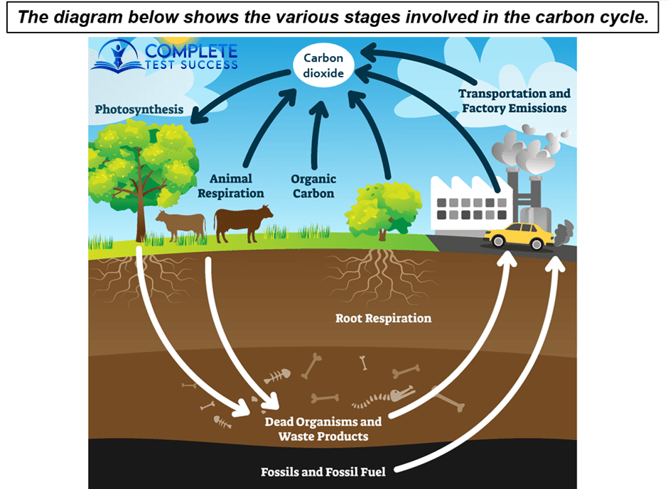
The image outlines the various phases included in the carbon cycle. Overall, the process begins with carbon dioxide transferring from the air into trees and ends with it being returned into the atmosphere from various sources. In total, there are seven stages, most of which are natural but also including some human influence.
First of all, through the process of photosynthesis, carbon dioxide is extracted from the air and enters trees. After this, trees and animals both become dead organisms and waste products which are found deep below the earth’s surface. Moving even deeper underground, it can be seen that there are deposits of fossils and fossil fuel.
From here, the dead organisms, waste products, fossils and fossils fuel are extracted for use in cars and factories, which, in turn, create transportation and factory emissions which release the carbon dioxide back into the air. As well as these emissions, carbon dioxide is returned to the atmosphere from natural sources, which are animal respiration, organic carbon and root respiration in plants.
Additional Sample Questions
You’ll find more reliable sample answers with the links below.
IELTS.org – Sample 1, Sample 2, Sample 3, Sample 4, Sample 5, Sample 6.
Cambridge – Sample 1.